
Going Visual With Data
Numbers can be an effective tool for communicating your department’s successes, but they can also intimidate. The reader spots a cluster of numbers down the page, panics slightly, and is tempted to skip over them. Good design can overcome this problem; in fact, infographics and data visualizations have been shown to improve reader comprehension and actually enhance the brain’s ability to recognize trends and patterns in numerical data.
When the LGBTQIA Resource Center approached us this August about creating a brochure to advertise their programming in a creative way, they already knew that they wanted to represent the wide variety of events and resources offered at the center through numbers from the previous academic year. Together, we developed the vibrant, multicolored brochure you see above: Love in Numbers. When you open the brochure, you see an infographic covering both sides. There is little text to read and the event and participant numbers presented in the infographic are easy to digest. The message is, in a low-pressure way: We’re doing great things and we want you to be a part of it.
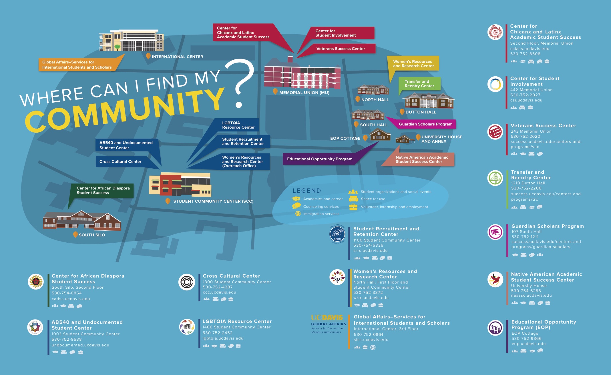
In the Where Can I Find My Community? map graphic on the Student Affairs website, campus buildings home to retention, resource and community centers seem to pop out from the [Rec Pool Blue] surface. New students yet to get their bearings will find this particularly helpful; the way the buildings look, faithfully rendered in the graphic, is much more likely to be remembered early on than names or addresses.